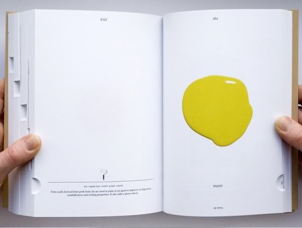
 picture source
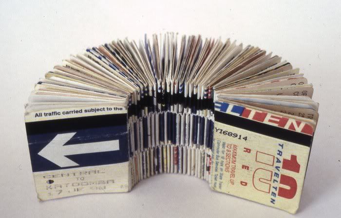
Bus ticket book that consist of 300 journeys. Everyday objects might not mean anything when it is stand alone. but when it is bounded together, the message is strong and clear.
 picture source
Steps to enlightenment.
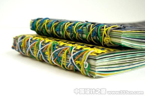
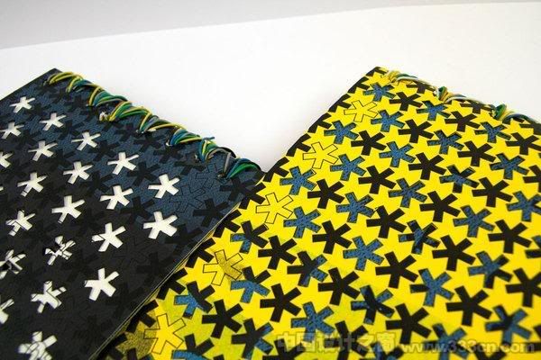
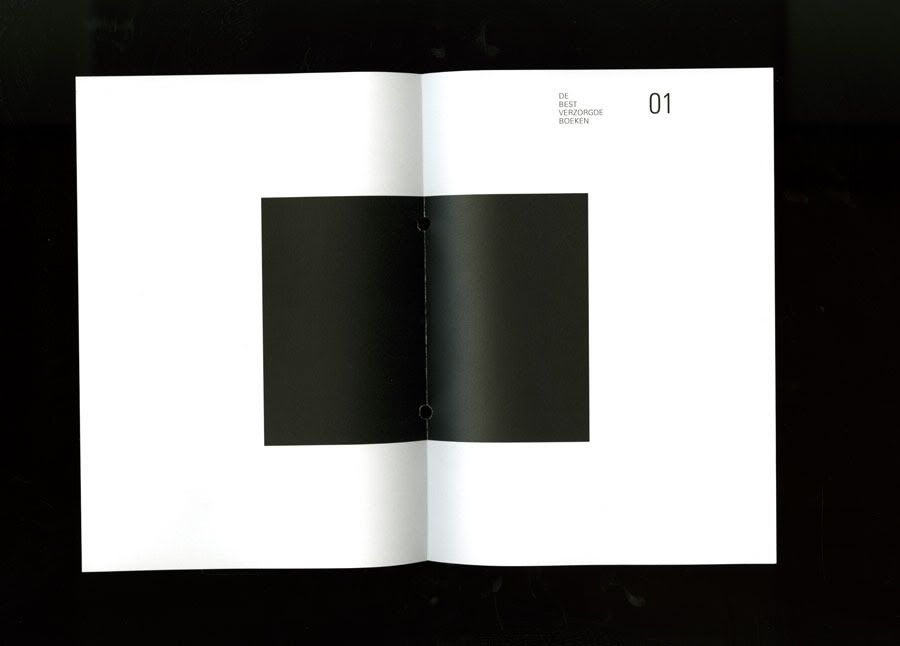
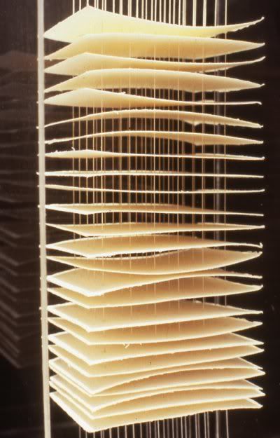
Exploded book binding. Yes. It is still a book since the pages are "binded" together.
I think book binding itself is an art form. Putting aside the functionality and economic aspects of a "proper book" for reading, book design is a true marry of art, craft and design. The space in between is very interesting that I could imagine more paper forms on each piece of paper and sculpted into a 3 dimensional building or something like that. That division of space allow viewers to imagine and dream.
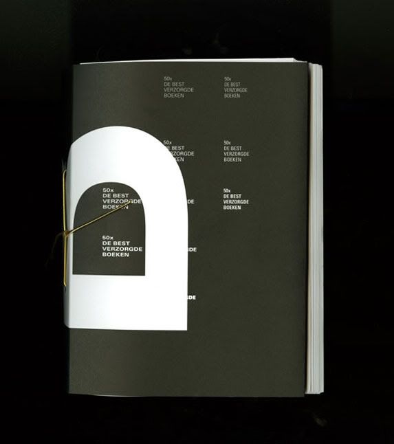
A very inspiring and power piece that opens up my mind that book binding need not be pivoted at a point.
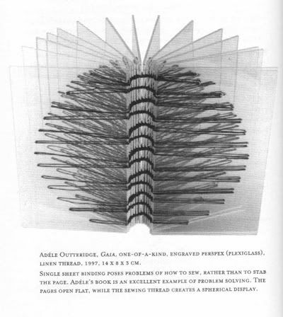
Picture source: Keith A.Smith and Fred A. Jordan, Bookbinding for book artists, Keith Smith book, 1998, NY, p.122
Outteridge is seen here as experimenting with materials and properties of materials. And a juggle between geometry and dimension. Same goes for the one below.
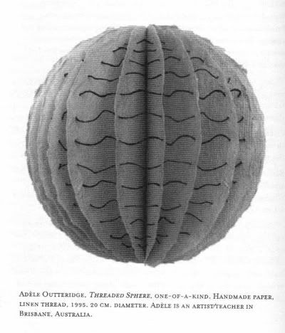
Picture source: Keith A.Smith and Fred A. Jordan, Bookbinding for book artists, Keith Smith book, 1998, NY, p.108
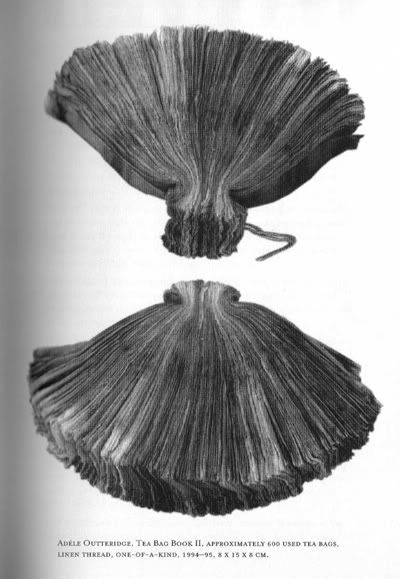
Picture source: Keith A.Smith and Fred A. Jordan, Bookbinding for book artists, Keith Smith book, 1998, NY, p.65
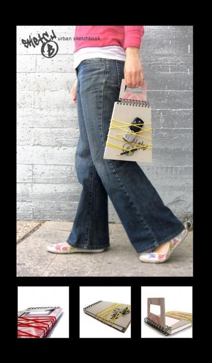
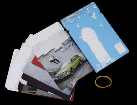
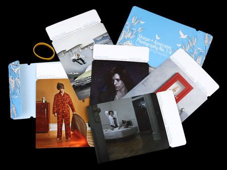
Again, daily objects used to create a book.
That reminded me of the Lipton tea bag tags I have been collecting since the start of this year.
I wonder how much can one push the boundary of using daily objects to make art?
A short biography of her can be found
here