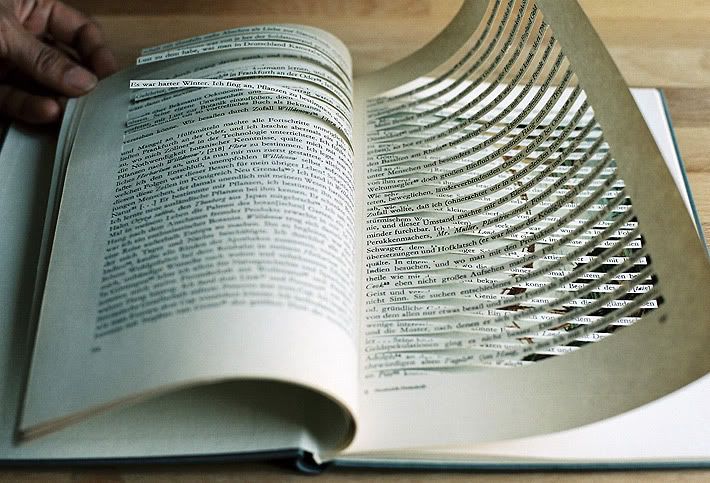
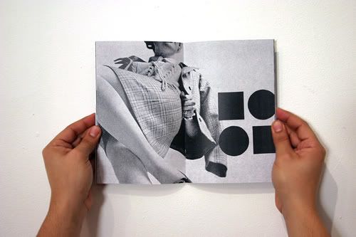
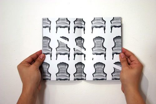
This study hopes to reshape experiences and allow one to look further into or beyond the human face.
Source
Wednesday, December 9, 2009
Deb Rindl
The Human Chain
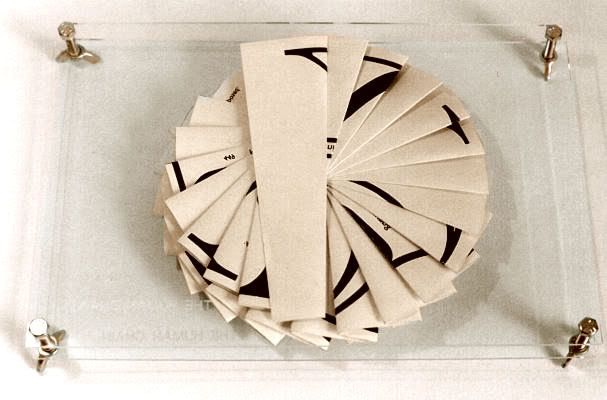
A multi-layered book of connections exploring events during the last two millennia in parallel with the fundamental essence of life - DNA. The common thread in both of these is their unchanging quality. Sometimes it seems that our only advance in twenty centuries is in the sophistication of the weaponry we use to dominate and kill each other. The technological aspect of modern life is underlined further when the book is held in its cover, thus resembling a slide under inspection in a microscope.
Times Square
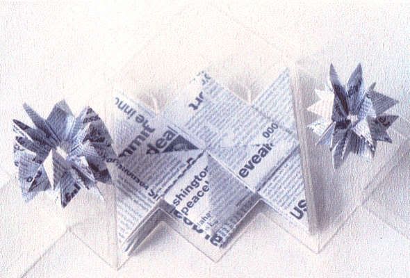
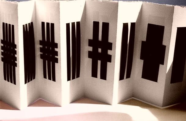
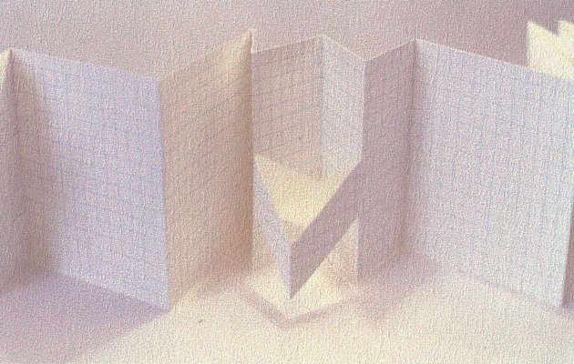
Concertina book containing cut-outs based on a two times table. Designed in the early part of 2001, it has now become topical rather than merely an observation, being reminiscent of the grid design of New York streets and of the skyscrapers to be found there.
Exercise Book
A simple three-dimensional pun. At first glance this seems to be just a small version of a traditional exercise book but on further inspection the cuts and folds reveal a series of physical exercises. Printed letterpress.
A Recipe for Disaster
This bookwork is a response to the current conflict in Afghanistan. From the perspex container in the shape of a stealth bomber come forth a bomb and two smaller bomblets. The bomblets are constructed of 'pages' spelling out 'Collateral Damage' whilst the main bomb contains the nub of the message in its text. This is punctuated by bullet points, some being bomb-shaped, some like tears. The whole piece is carried in a grey card box reminiscent of an attractive sweet box, just as the cluster bombs being spread around Afghanistan are designed to resemble toys, to appeal to children and encourage them to be picked up. The results, of course, are disastrous.
Tuesday, December 8, 2009
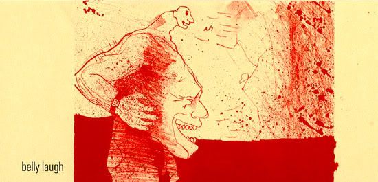
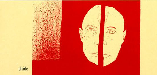
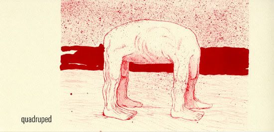
alphabet book with 26 lithographs
" The words in this alphabet book were selected from a dictionary. A series of 26 prints was created to accompany the words. Spontaneous drawing marks were used to create a chaos with the order of the alphabet representing the human
condition"
Source
" The words in this alphabet book were selected from a dictionary. A series of 26 prints was created to accompany the words. Spontaneous drawing marks were used to create a chaos with the order of the alphabet representing the human
condition"
Source
Books by graduate students
Treating the heart as a symbol, this book is made as a box for two heart-shaped ceramic bowls. The pages are made with heart-like cutouts into which the bowls fit when closed, and that also serve as decorative elements repeating the theme. The book is made of four-ply two-colored illustration board and adhesive-bound together with the covers. Covers include a clasp which securely holds the book shut to prevent the bowls from falling out. This book incorporates three-dimensional objects, in this case ceramic bowls. It functions as a box and at the same time as a book about a heart.
The merger of 2 dimensional and 3 dimensional art. Over here the book is a secondary item to contain the heart. But it merges well enough to translate the concept into physical item.
Source
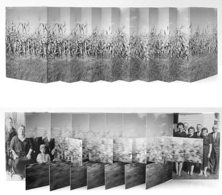
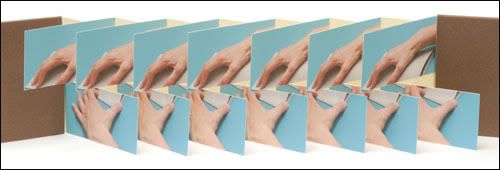
Karen Hanmer
Playful works fragment and layer text and image to intertwine memory, cultural history, and the history of science. I find her work has strong interest in dealing the the element of time and a play with viewer's mind.
An action or motion always exist in her pieces.
She also uses flag book structure to express this ongoing motion in her work.
Karen Hanmer
Minimalist book design
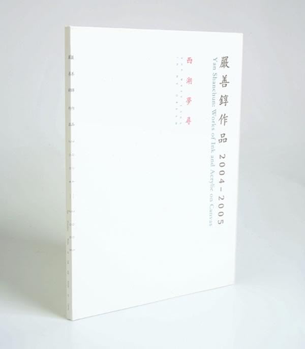
A book on China and Korea Calligraphy.
It amplifies the beauty of the characters stroke with the use of the spine of the book. The cover portrays calligraphic elements like the vertical writings, the whiteness, format of reading it and with contemporary elements of using white space to heighten the effect of the characters.
Soure
It amplifies the beauty of the characters stroke with the use of the spine of the book. The cover portrays calligraphic elements like the vertical writings, the whiteness, format of reading it and with contemporary elements of using white space to heighten the effect of the characters.
Soure
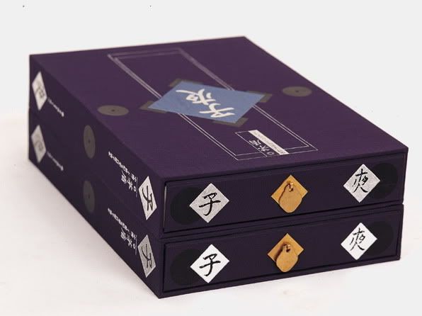
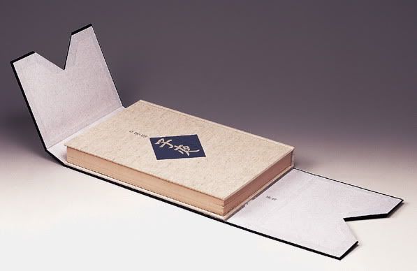
Zi Ye
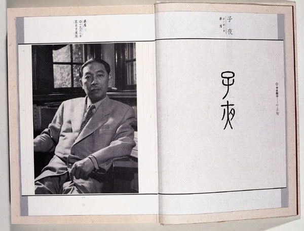
Looking at the book's layout design from the eastern, it reveals the traces of structure that confines the top and bottom as margin with the use of lines. Vertical format for the chinese characters. And the corners, which are normally wrapped with cloth for the binding.
The tradition of symmetry is clearly seen in this design.
One interesting point to note is that the designer the casing of the book reveals the printed title on the cover giving reader layers of surprises as they open the whole package.
Source
Source
Monday, December 7, 2009
What are artists' books?
Artists' books are not books about art; they are art expressed through book form. When the content and form of a book are considered together, and given equal significance, the book becomes more than a simple container for information. The goal of many book artists is to involve the reader actively in the viewing process, not only to see the words on the page but also to think about how the words, pictures, and physical form of the object all contribute to the meaning.
In the western tradition, readers are so familiar with the codex or traditional book format that they rarely think about the form, only about the contents. To break out of this mindset, the format of the book must step out of the ordinary, in whatever small or large way, so that the reader will no longer take it for granted. Instead, the form of the book becomes an integral and dynamic part of the work and of the reader's experience. This can be achieved simply by changing the traditional codex form into a scroll or accordion, by altering the typography, or by the use of creative binding materials so that the work draws attention to itself as a whole. Some book artists go further, altering the form to the point that the book no longer functions for reading. Bindings have been torn, glued shut, or tied up, text may be transformed or unintelligible. All that is left is the idea of the book and the viewer's reaction to it.
Artists' books are not really a new concept. Several traditions in book publishing can be seen as precursors to this modern notion. Perhaps the earliest example of a book artist in the modern sense was William Blake (1757-1827). Blake, a poet, painter, engraver, and visionary mystic, produced a series of remarkable books in which the illustrations were intrinsic to his text. He not only wrote and illustrated the books, but also pulled the etchings, hand colored the plates, and sold them in multiple editions. However, he worked so far outside of the mainstream of his day, that he had no immediate followers.
A clearer line can be drawn from another nineteenth century artistic innovation. That is the livre d'artiste which became popular in France during the 1890's. The art dealer Ambroise Vollard began to commission his artists to illustrate texts, often classics, and then to have these works finely printed and bound. The livre d'artiste emphasized the illustrations in the book and produced a beautiful well-crafted work similar to today's fine press illustrated book. However, these are not works conceived and produced by the artist, and to some cannot be considered artists' books in the modern sense.
The idea of artists becoming involved with inexpensive multiple editions of their own works in published format may be seen in the work of the Futurists, Dadaists, and Constructivists of the early part of this century. These groups manipulated the boundaries between art forms particularly in the integration of typography and image in their manifestos. This trend was revived in the late 1950's and 1960's by the Fluxus group, who begin publishing their own works by creating the Something Else Press in 1964.
Finally changes in the larger art world of the 1960s were a key component of the development of the contemporary artists' book. During this period, artists sought ways to bypass the traditional gallery and museum systems. Alternative artists' spaces, co-ops, happenings, performance art, and other innovations became vehicles used to reject the materialism and bureaucracy of the mainstream contemporary art world. Advances in technology from Polaroid cameras to photocopiers to computers soon allowed artists to become their own publishers.
By UNIVERSITY OF DELAWARE LIBRARY
Special Collections Department
Sunday, December 6, 2009
Royal bookbinding
As a tradition in the western, books are extensively decorated with gold. Primarily, books were precious in the past and books only exist as bibles
Source
list of book arts
list of book arts
http://www.dmoz.org/Arts/Crafts/Paper/Book_Arts/
http://www.bookarts.uwe.ac.uk/artbkmks.htm
http://www.dmoz.org/Arts/Crafts/Paper/Book_Arts/
http://www.bookarts.uwe.ac.uk/artbkmks.htm
Wednesday, December 2, 2009
Urban Jealousy
April 2008 - book project for "Urban Jealousy", 1st International Roaming Biennial of Tehran
Book redesign: Nicolas Bourquin and Jeannette Gaussi. Unique piece.
A "Jalousie" is a window that one can see through but not be seen. International and Iranian artists are given an understanding of their very own jalousie perspective. In this context the artwork of Nicolas Bourquin and Jeannette Gaussi propose to re-read the lifework of Alexander von Humboldt.
By onlab
The position of books in the IT world.
From Kenya Hara's book on Designing Design, p.169-201, where he talks about books as Information Sculpture. He argued that under the evolution of information technology leg to the foundation of more and more information formats. Under this development, it might be possible that books have already stepped down from their traditional role as information medium. Ebooks replace conventional books nowadays. Faster, lighter and condensed within a gadget.
But he consider us to reevaluate what a book is.
He stated about the most primary material of a book, paper. Where in comparison to the speeding up of information transfer, we view paper as "a kind of unconscious surface", taken for granted. So much so when human moves to monitors, we consider our era the "paperless" era, as mentioned by Kenya Hara.
Reviewing books as information sculpture in comparison to the IT, such information like letters printed on paper, the weight of the book, the senses we connect while flipping a book are irreplaceable with technology. No doubt that one day technology might be able to achieve that. A physical book is merely text and images complied but as a whole, sending and connecting information with our past, senses and that very moment of viewing the book. "...we may have a more pleasant user experience and be more satisfied with information presented on a material of moderate weight and texture than information whose presence has become rarified through compression into a tiny space." (p.198)
This continual interest in materiality and connection with sensory of books triggers my thoughts on how I can rekindle the position of a book in the IT world. The emotion attached to reading from a piece of printed paper versus holding a screen reading is totally different in experience. Basic elements of design comes into place where printed materials has margins, borders, white spaces for reading to read at ease. Texture of the paper could be customized according to preferences. The environment lighting that affects our reading atmosphere all merge in as one experience to read on something physically printed. What's more? The excitement it creates when one opens up a new book, smelling the ink and paper. The experience consist of many dimensions,
which further define the stand of a book in this digital world.
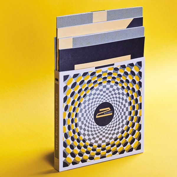
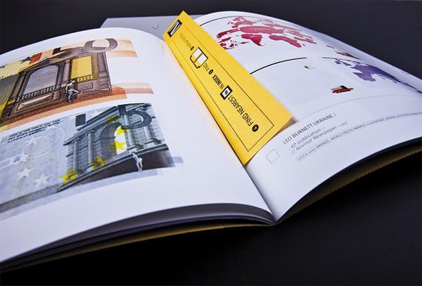
Blackbox2
Unexpected and provocative book created by designers for designers by Brand Managers for brand
A design catalogue by Victor Konovalov
Tuesday, December 1, 2009
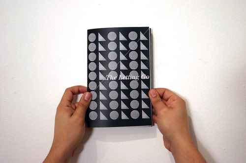
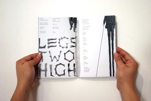
Poetry and Art: The Letting Go
A fusion between poetry and art.
Reference point on how narrative form is depicted in a artist's book manner. The relationship between the poetry and the images reemphasize the text itself.
The elements of design used in this book reminded us about the destructive art by the Dada from the modern art.
Source
Friday, October 16, 2009
Wednesday, October 14, 2009
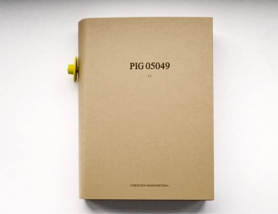
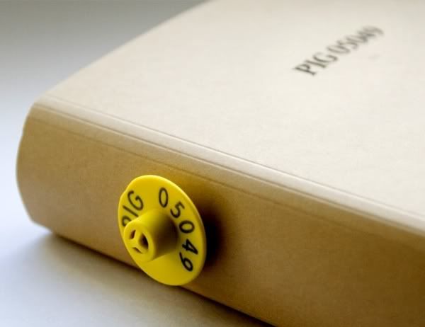
Pig 05049 by Christien Meindertsma
‘PIG 05049′ by Dutch designer Christien Meindertsma, a book documenting the products made from a pig, won the Play category of the Index Awards, which were announced yesterday.
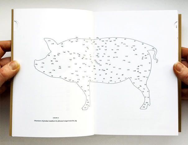
Name of a pig whom was tagged with number 05049, was raised on a Dutch farm. And this book took her 3 years to find out where did the pig go after death. The pig was made into products and related to bullets.
Many kids nowadays have the problem even to visualise the animals, like pigs or chicken. They may just appear like a drawn picture in their mind instead of a live animal.
This is almost like a reverse analogy of what is happening to our world and addressing the the number of by-products one pig can be made into.
The aim of this book is to raise the awareness of our environment. Knowing where our primary resources come from, and hopefully, cherish them as if they are the first and the last on earth.
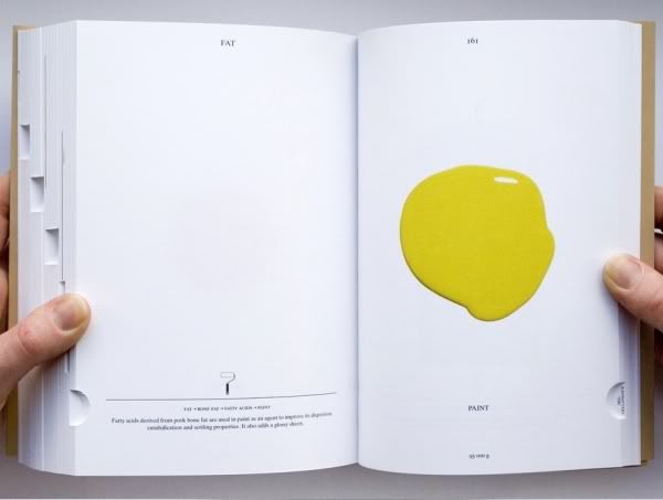
Her pages consist of minimium text and she emphasize on the visual statement on each page. It is also interesting to note that the visuals in the book are of 1:1 actual scale. An exhibition was also put up to publicize the idea. All the products were placed physically in a supermarket cooling fridge.
Poor Mr Pig...but its a lucky chap to have such a massive record of its after life.
Watch this video on how she and her prof talks about the project.
Website
Subscribe to:
Posts (Atom)